9709 P63 - Nov 2013 - Q1
2401
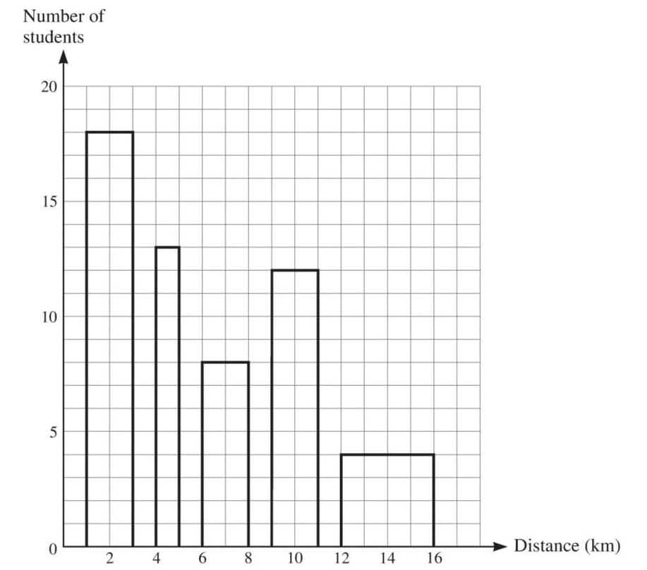
The distance of a student’s home from college, correct to the nearest kilometre, was recorded for each of 55 students. The distances are summarised in the following table.
| Distance from college (km) | 1–3 | 4–5 | 6–8 | 9–11 | 12–16 |
|---|---|---|---|---|---|
| Number of students | 18 | 13 | 8 | 12 | 4 |
Dominic is asked to draw a histogram to illustrate the data. Dominic’s diagram is shown below.
Give two reasons why this is not a correct histogram.
Solutions locked. Please sign in with access to view them.